Advanced form components with Alpine and Rails
Make hidden inputs really valuable
Software engineer in my soul. Been building since early 2000.
Sometime ago I posted article about alpine.js usage with Ruby on Rails app and also another article about ViewComponents
Today I want to show you how can you implement really advanced form(and not just) input components. By advanced I mean something like custom drop-downs, toggles, or anything other that you can't create/style with regular inputs

The idea is to use Alpine.js together with hidden inputs which would hold your input state and then wrap it into ViewComponent, so it could be reused in any of your forms
Implementation
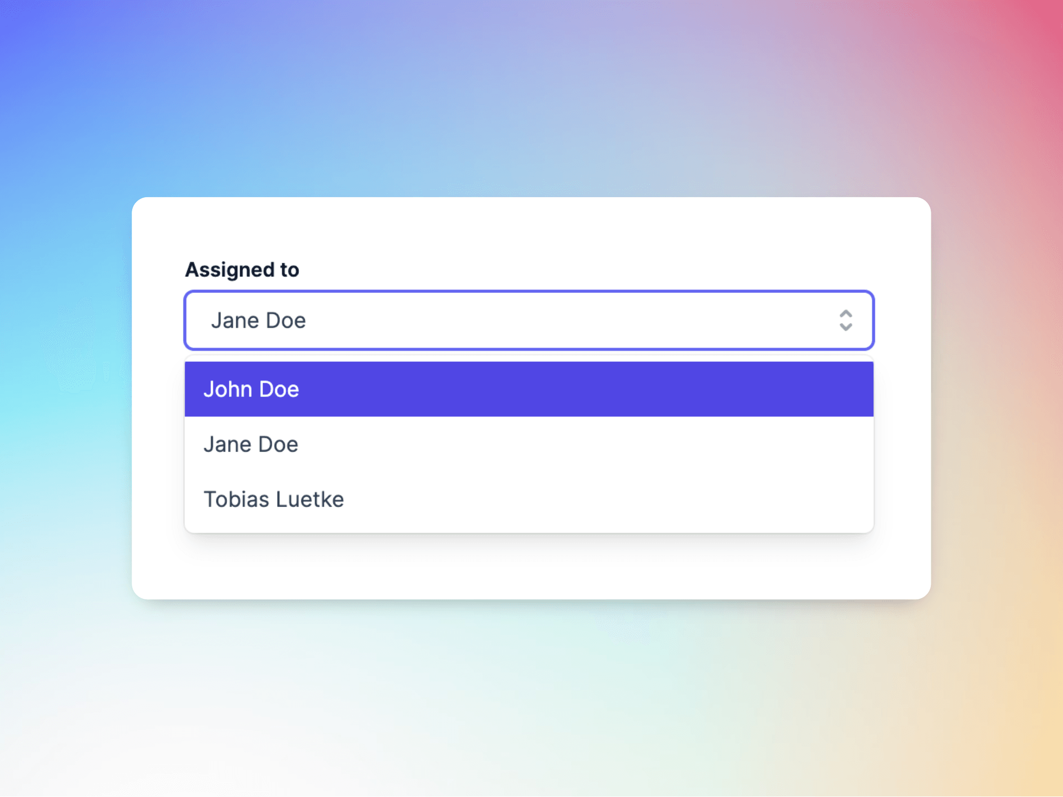
As an example I use dropdown from screenshot above. This is tailwind styled component, but it is a good example of more advanced component.
This is how it would look like in simplest implementation
# custom_dropdown_component.rb
class CustomDropdownComponent < ViewComponent::Base
  def initialize(options:, selected_option: nil, form:, field_name:)
    @options = options
    @selected_option = selected_option
    @form = form
    @field_name = field_name
  end

  private

  attr_reader :options, :selected_option, :form, :field_name
end

# custom_dropdown_component.html.erb

<div x-data="{ open: false, selectedOption: '<%= selected_option %>' }" class="relative pointer-events-auto w-[28.125rem] text-[0.8125rem] leading-5 text-slate-700">
  <div class="font-semibold text-slate-900">Assigned to</div>
  <div class="relative mt-1">
  <button @click="open = !open" type="button" class="w-full bg-white border border-gray-300 rounded-md shadow-sm px-4 py-2 text-left cursor-default focus:outline-none focus:ring-1 focus:ring-indigo-500 focus:border-indigo-500 sm:text-sm">
    <span x-text="selectedOption || 'Select an option'"></span>
    <span class="ml-3 absolute inset-y-0 right-0 flex items-center pr-2 pointer-events-none">
      <!-- Heroicon name: solid/selector -->
      <svg class="h-5 w-5 text-gray-400" xmlns="http://www.w3.org/2000/svg" viewBox="0 0 20 20" fill="currentColor" aria-hidden="true">
        <path fill-rule="evenodd" d="M10 3a1 1 0 01.707.293l3 3a1 1 0 01-1.414 1.414L10 5.414 7.707 7.707a1 1 0 01-1.414-1.414l3-3A1 1 0 0110 3zm-3.707 9.293a1 1 0 011.414 0L10 14.586l2.293-2.293a1 1 0 011.414 1.414l-3 3a1 1 0 01-1.414 0l-3-3a1 1 0 010-1.414z" clip-rule="evenodd" />
      </svg>
    </span>
  </button>
  </div>

  <div x-show="open" @click.away="open = false" class="absolute z-10 mt-1 w-full bg-white shadow-lg max-h-60 rounded-md py-1 text-base ring-1 ring-black ring-opacity-5 overflow-auto focus:outline-none sm:text-sm">
    <% options.each do |option| %>
      <div @click="selectedOption = '<%= option[:value] %>'; open = false" class="cursor-pointer select-none relative py-2 pl-3 pr-9 hover:bg-indigo-600 hover:text-white">
        <%= option[:value] %>
      </div>
    <% end %>
  </div>
  <%= form.hidden_field field_name, 'x-model': "selectedOption" %>

  <div class="mt-2 text-slate-900">Current selected value inside hidden_field: <span x-text="selectedOption"></span></div>
</div>

# Your template

<%= form_with do |f| %> # There can be your form for your model
  <%= render(CustomDropdownComponent.new(form: f, field_name: :test, options: [{id: 1, value: 'John Doe'}, {id: 2, value: 'Jane Doe'}, { id: 3, value: 'Tobias Luetke'}]))%>
<% end %>
And final result would look like below

All the magic happens thanks to this:
<%= form.hidden_field field_name, 'x-model': "selectedOption" %>
where x-model is responsible to setting proper value to hidden_field upon any action from page. So when you click on any of dropdown elements
<div @click="selectedOption = '<%= option[:value] %>'; open = false"><%= option[:value]</div> we have @click handler which sets `selectedOption` to interpolated value of our option.
You can have any interface you prefer, either hash or specific DropdownItem class which has needed methods for your case.
Conclusion
With this approach you can have any form inputs you can come up with or find online. For example for tailwind there are few really cool UI kits which you can use right away. This can save time on your UI, especially if you work on MVP and you'd prefer to work on core features rather than UI
By using ViewComponent you also make your UI more reusable, since all form inputs can be used across all your forms not just one
For more interesting content follow me on X where I post daily
